CDFs for calibration curves
Histograms are decent visualizations for PDFs with lots of samples...

...but if there are only a few samples, the histogram-binning choices can matter a lot:


The binning (a) discards information, and worse, (b) is mathematically un-aesthetic.
But a CDF doesn't have this problem!

If you make a bunch of predictions, and you want to know how well they're calibrated, classically you make a graph like this:
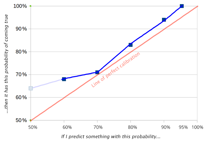
But, as with a histogram, this depends on how you bin your predictions.


Is there some CDF-like equivalent here? Some visualization with no free parameters?
I asked that to several people at Arbor Summer Camp. I got three answers:
-
"You get from a PDF to a CDF by integrating. So, here, analogously, let's integrate (num predictions with confidence < x that came true) minus (expected num predictions with confidence < x that came true)."
-
(the same thing, said in different words)
-
(the same thing, said in different words)
If we make a "CDF" for the above 100 predictions by applying these three insights, we get:

CDFs are a little harder to read than histograms, and I find this a little harder to read than the calibration plots above. The thing to keep in mind, I think, is: when the curve is going up, it's a sign your probabilities are too high; when it's going down, it's a sign your probabilities are too low.
Test: how would you describe the problems that these two predictors have?

